

Less On the Page, More In the Mind
How restraint and breathing room convert better than cluttered, busy layouts.

Less On the Page, More In the Mind
Written by
Sr. Manager Design

Cluttered layouts feel like more effort. More options, more messages, more reasons to convert. In practice, they do the opposite. Restraint and breathing room consistently outperform busy design because clarity converts, clutter doesn't.
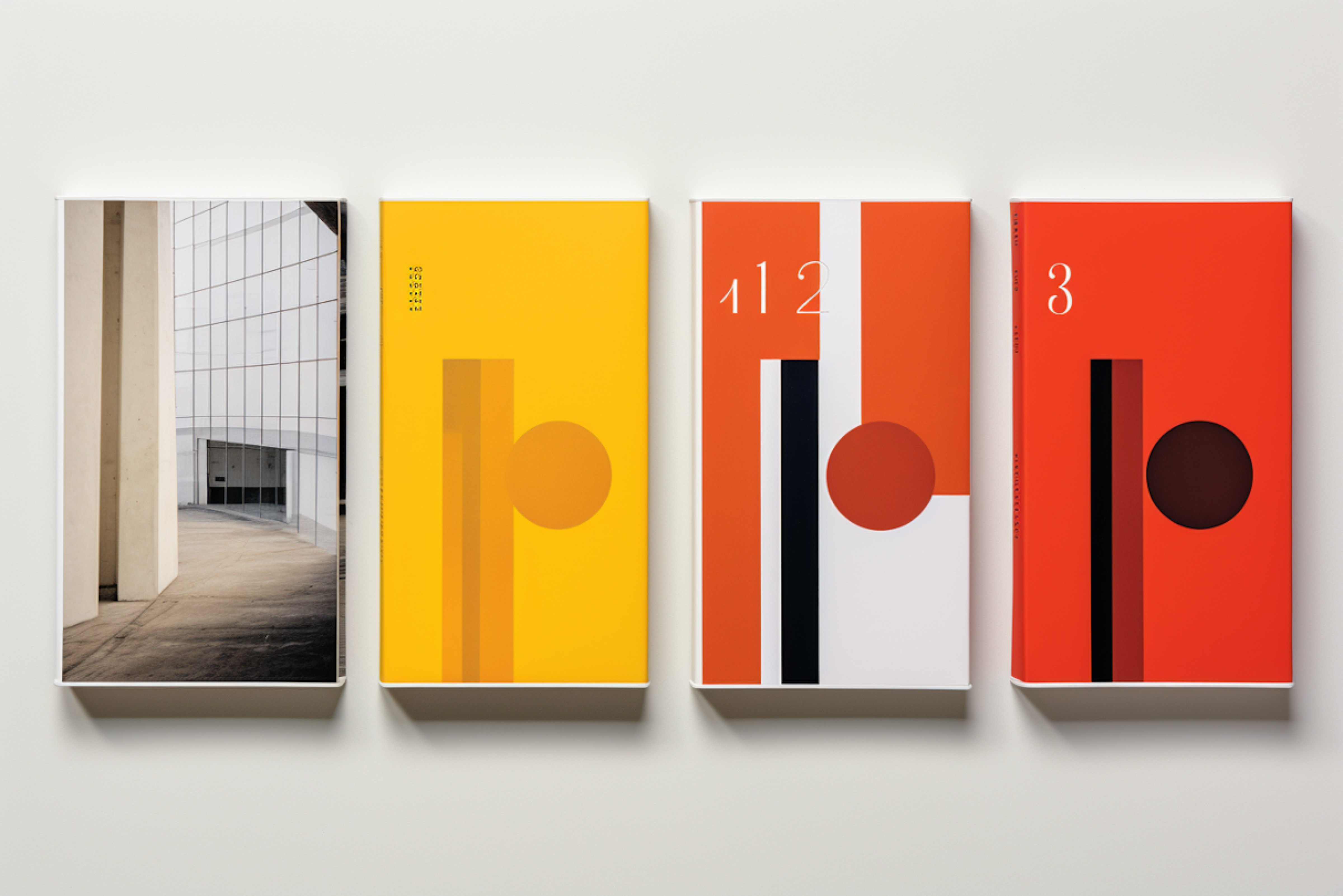
Restraint Works Harder Than It Looks
When too many elements compete for attention, users spend energy sorting signal from noise instead of moving toward a decision. That friction slows conversion and weakens the overall experience.
Whitespace isn't decorative. It creates visual separation, improves scanability, and directs attention toward the headline, offer, or CTA that should carry the page. Every gap on a well-designed page is doing a job.
There’s a Cost to a Busy Layout
Busy layouts hurt conversion in predictable ways:
The headline gets diluted and the page's main point becomes unclear
Attention spreads across too many visuals and CTAs
The page feels unfocused, which quietly erodes trust
The next step gets buried, so users have to search for the action ations
On landing pages this is especially expensive. A strong offer sitting inside a noisy layout means paying for traffic that doesn't convert.
Discipline Over Decoration, Always
Strong brand pages and landing pages tend to share the same structure:
A sharp headline that states what the brand does
Short supporting copy that clarifies the promise
One dominant CTA
Enough whitespace to separate sections cleanly
Visuals that reinforce meaning rather than competing with it
Key Takeaways
Whitespace is emphasis, not absence. It directs attention toward what matters
Clutter creates choice overload, and the safest choice becomes no choice at all
Every element on a page should help understanding or drive action, nothing else
Clean layouts feel more premium because restraint signals confidence
Less on the page works when it creates more clarity, more trust, and more memory

Stay Updated with The Go-To Guy

More articles

Wednesday, October 7, 2026
Written by
Sunny Singh
Grok AI and SEO: How AI Search Is Changing SEO
There’s more to being found.
Learn what Grok and AI search mean for SEO and how your content gets picked for answers.

Friday, September 11, 2026
Written by
Waseq Shaaz
Why AI makes brands look the same & how to beat it
The Role of Human Intelligence & Strategy in Creating Brand Distinction
AI makes branding faster, but can make brands look the same. Learn how Brand Strategy gives your brand a clear idea and helps it look different and be remembered.

Friday, August 7, 2026
Written by
Ajay Kulkarni
How to Track AI Traffic in GA4 (ChatGPT, Gemini & Perplexity)
Track AI Assistant Traffic in GA4 for Better Insights
Track AI traffic in GA4 with new AI Assistant channels and insights to optimize SEO strategy, content performance, and digital marketing efforts.
Thursday, February 26, 2026
Written by
Ajay Kulkarni
Where Did the Ad Budget Go?
The hidden budget drains killing your ROAS, and how to plug them fast.
ROAS drops gradually, through small inefficiencies that each look manageable on their own. By the time the numbers look bad, the budget has been leaking for weeks. Here's where to look and what to fix first.

Wednesday, February 25, 2026
Written by
Aryaa Dhavse
Loud Isn't the Same as Clear
Building a brand voice that cuts through noise without shouting louder than everyone else.
Most brands respond to a crowded market by turning up the volume. More posts, bigger claims, louder creative. The brands people actually remember usually do the opposite.
Less On the Page, More In the Mind
How restraint and breathing room convert better than cluttered, busy layouts.
Less On the Page, More In the Mind
Written by
Sr. Manager Design
Cluttered layouts feel like more effort. More options, more messages, more reasons to convert. In practice, they do the opposite. Restraint and breathing room consistently outperform busy design because clarity converts, clutter doesn't.
Restraint Works Harder Than It Looks
When too many elements compete for attention, users spend energy sorting signal from noise instead of moving toward a decision. That friction slows conversion and weakens the overall experience.
Whitespace isn't decorative. It creates visual separation, improves scanability, and directs attention toward the headline, offer, or CTA that should carry the page. Every gap on a well-designed page is doing a job.
There’s a Cost to a Busy Layout
Busy layouts hurt conversion in predictable ways:
The headline gets diluted and the page's main point becomes unclear
Attention spreads across too many visuals and CTAs
The page feels unfocused, which quietly erodes trust
The next step gets buried, so users have to search for the action ations
On landing pages this is especially expensive. A strong offer sitting inside a noisy layout means paying for traffic that doesn't convert.
Discipline Over Decoration, Always
Strong brand pages and landing pages tend to share the same structure:
A sharp headline that states what the brand does
Short supporting copy that clarifies the promise
One dominant CTA
Enough whitespace to separate sections cleanly
Visuals that reinforce meaning rather than competing with it
Key Takeaways
Whitespace is emphasis, not absence. It directs attention toward what matters
Clutter creates choice overload, and the safest choice becomes no choice at all
Every element on a page should help understanding or drive action, nothing else
Clean layouts feel more premium because restraint signals confidence
Less on the page works when it creates more clarity, more trust, and more memory
Stay Updated with The Go-To Guy
More articles
Grok AI and SEO: How AI Search Is Changing SEO
There’s more to being found.
Why AI makes brands look the same & how to beat it
The Role of Human Intelligence & Strategy in Creating Brand Distinction
How to Track AI Traffic in GA4 (ChatGPT, Gemini & Perplexity)
Track AI Assistant Traffic in GA4 for Better Insights
Where Did the Ad Budget Go?
The hidden budget drains killing your ROAS, and how to plug them fast.
Loud Isn't the Same as Clear
Building a brand voice that cuts through noise without shouting louder than everyone else.
Less On the Page, More In the Mind
How restraint and breathing room convert better than cluttered, busy layouts.
Less On the Page, More In the Mind
Written by
Sr. Manager Design
Cluttered layouts feel like more effort. More options, more messages, more reasons to convert. In practice, they do the opposite. Restraint and breathing room consistently outperform busy design because clarity converts, clutter doesn't.
Restraint Works Harder Than It Looks
When too many elements compete for attention, users spend energy sorting signal from noise instead of moving toward a decision. That friction slows conversion and weakens the overall experience.
Whitespace isn't decorative. It creates visual separation, improves scanability, and directs attention toward the headline, offer, or CTA that should carry the page. Every gap on a well-designed page is doing a job.
There’s a Cost to a Busy Layout
Busy layouts hurt conversion in predictable ways:
The headline gets diluted and the page's main point becomes unclear
Attention spreads across too many visuals and CTAs
The page feels unfocused, which quietly erodes trust
The next step gets buried, so users have to search for the action ations
On landing pages this is especially expensive. A strong offer sitting inside a noisy layout means paying for traffic that doesn't convert.
Discipline Over Decoration, Always
Strong brand pages and landing pages tend to share the same structure:
A sharp headline that states what the brand does
Short supporting copy that clarifies the promise
One dominant CTA
Enough whitespace to separate sections cleanly
Visuals that reinforce meaning rather than competing with it
Key Takeaways
Whitespace is emphasis, not absence. It directs attention toward what matters
Clutter creates choice overload, and the safest choice becomes no choice at all
Every element on a page should help understanding or drive action, nothing else
Clean layouts feel more premium because restraint signals confidence
Less on the page works when it creates more clarity, more trust, and more memory
Stay Updated with The Go-To Guy
More articles
Grok AI and SEO: How AI Search Is Changing SEO
There’s more to being found.
Why AI makes brands look the same & how to beat it
The Role of Human Intelligence & Strategy in Creating Brand Distinction
How to Track AI Traffic in GA4 (ChatGPT, Gemini & Perplexity)
Track AI Assistant Traffic in GA4 for Better Insights
Where Did the Ad Budget Go?
The hidden budget drains killing your ROAS, and how to plug them fast.
Loud Isn't the Same as Clear
Building a brand voice that cuts through noise without shouting louder than everyone else.

We Transform Brands. Your Success Is Next.
Start your project now by booking a one-on-one consultation with our expert.
Meet the partners who are part of our success story



We Transform Brands. Your Success Is Next.
Start your project now by booking a one-on-one consultation with our expert.
Meet the partners who are part of our success story
Less On the Page, More In the Mind
How restraint and breathing room convert better than cluttered, busy layouts.
Less On the Page, More In the Mind
Written by
Sr. Manager Design
Cluttered layouts feel like more effort. More options, more messages, more reasons to convert. In practice, they do the opposite. Restraint and breathing room consistently outperform busy design because clarity converts, clutter doesn't.
Restraint Works Harder Than It Looks
When too many elements compete for attention, users spend energy sorting signal from noise instead of moving toward a decision. That friction slows conversion and weakens the overall experience.
Whitespace isn't decorative. It creates visual separation, improves scanability, and directs attention toward the headline, offer, or CTA that should carry the page. Every gap on a well-designed page is doing a job.
There’s a Cost to a Busy Layout
Busy layouts hurt conversion in predictable ways:
The headline gets diluted and the page's main point becomes unclear
Attention spreads across too many visuals and CTAs
The page feels unfocused, which quietly erodes trust
The next step gets buried, so users have to search for the action ations
On landing pages this is especially expensive. A strong offer sitting inside a noisy layout means paying for traffic that doesn't convert.
Discipline Over Decoration, Always
Strong brand pages and landing pages tend to share the same structure:
A sharp headline that states what the brand does
Short supporting copy that clarifies the promise
One dominant CTA
Enough whitespace to separate sections cleanly
Visuals that reinforce meaning rather than competing with it
Key Takeaways
Whitespace is emphasis, not absence. It directs attention toward what matters
Clutter creates choice overload, and the safest choice becomes no choice at all
Every element on a page should help understanding or drive action, nothing else
Clean layouts feel more premium because restraint signals confidence
Less on the page works when it creates more clarity, more trust, and more memory
Stay Updated with The Go-To Guy
More articles
Wednesday, October 7, 2026
Written by
Sunny Singh
Grok AI and SEO: How AI Search Is Changing SEO
There’s more to being found.
Learn what Grok and AI search mean for SEO and how your content gets picked for answers.
Friday, September 11, 2026
Written by
Waseq Shaaz
Why AI makes brands look the same & how to beat it
The Role of Human Intelligence & Strategy in Creating Brand Distinction
AI makes branding faster, but can make brands look the same. Learn how Brand Strategy gives your brand a clear idea and helps it look different and be remembered.
Friday, August 7, 2026
Written by
Ajay Kulkarni
How to Track AI Traffic in GA4 (ChatGPT, Gemini & Perplexity)
Track AI Assistant Traffic in GA4 for Better Insights
Track AI traffic in GA4 with new AI Assistant channels and insights to optimize SEO strategy, content performance, and digital marketing efforts.
Thursday, February 26, 2026
Written by
Ajay Kulkarni
Where Did the Ad Budget Go?
The hidden budget drains killing your ROAS, and how to plug them fast.
ROAS drops gradually, through small inefficiencies that each look manageable on their own. By the time the numbers look bad, the budget has been leaking for weeks. Here's where to look and what to fix first.
Wednesday, February 25, 2026
Written by
Aryaa Dhavse
Loud Isn't the Same as Clear
Building a brand voice that cuts through noise without shouting louder than everyone else.
Most brands respond to a crowded market by turning up the volume. More posts, bigger claims, louder creative. The brands people actually remember usually do the opposite.
Less On the Page, More In the Mind
How restraint and breathing room convert better than cluttered, busy layouts.
Less On the Page, More In the Mind
Written by
Sr. Manager Design
Cluttered layouts feel like more effort. More options, more messages, more reasons to convert. In practice, they do the opposite. Restraint and breathing room consistently outperform busy design because clarity converts, clutter doesn't.
Restraint Works Harder Than It Looks
When too many elements compete for attention, users spend energy sorting signal from noise instead of moving toward a decision. That friction slows conversion and weakens the overall experience.
Whitespace isn't decorative. It creates visual separation, improves scanability, and directs attention toward the headline, offer, or CTA that should carry the page. Every gap on a well-designed page is doing a job.
There’s a Cost to a Busy Layout
Busy layouts hurt conversion in predictable ways:
The headline gets diluted and the page's main point becomes unclear
Attention spreads across too many visuals and CTAs
The page feels unfocused, which quietly erodes trust
The next step gets buried, so users have to search for the action ations
On landing pages this is especially expensive. A strong offer sitting inside a noisy layout means paying for traffic that doesn't convert.
Discipline Over Decoration, Always
Strong brand pages and landing pages tend to share the same structure:
A sharp headline that states what the brand does
Short supporting copy that clarifies the promise
One dominant CTA
Enough whitespace to separate sections cleanly
Visuals that reinforce meaning rather than competing with it
Key Takeaways
Whitespace is emphasis, not absence. It directs attention toward what matters
Clutter creates choice overload, and the safest choice becomes no choice at all
Every element on a page should help understanding or drive action, nothing else
Clean layouts feel more premium because restraint signals confidence
Less on the page works when it creates more clarity, more trust, and more memory
Stay Updated with The Go-To Guy
More articles
Grok AI and SEO: How AI Search Is Changing SEO
There’s more to being found.
Why AI makes brands look the same & how to beat it
The Role of Human Intelligence & Strategy in Creating Brand Distinction
How to Track AI Traffic in GA4 (ChatGPT, Gemini & Perplexity)
Track AI Assistant Traffic in GA4 for Better Insights
Where Did the Ad Budget Go?
The hidden budget drains killing your ROAS, and how to plug them fast.
Loud Isn't the Same as Clear
Building a brand voice that cuts through noise without shouting louder than everyone else.
Less On the Page, More In the Mind
How restraint and breathing room convert better than cluttered, busy layouts.
Less On the Page, More In the Mind
Written by
Sr. Manager Design
Cluttered layouts feel like more effort. More options, more messages, more reasons to convert. In practice, they do the opposite. Restraint and breathing room consistently outperform busy design because clarity converts, clutter doesn't.
Restraint Works Harder Than It Looks
When too many elements compete for attention, users spend energy sorting signal from noise instead of moving toward a decision. That friction slows conversion and weakens the overall experience.
Whitespace isn't decorative. It creates visual separation, improves scanability, and directs attention toward the headline, offer, or CTA that should carry the page. Every gap on a well-designed page is doing a job.
There’s a Cost to a Busy Layout
Busy layouts hurt conversion in predictable ways:
The headline gets diluted and the page's main point becomes unclear
Attention spreads across too many visuals and CTAs
The page feels unfocused, which quietly erodes trust
The next step gets buried, so users have to search for the action ations
On landing pages this is especially expensive. A strong offer sitting inside a noisy layout means paying for traffic that doesn't convert.
Discipline Over Decoration, Always
Strong brand pages and landing pages tend to share the same structure:
A sharp headline that states what the brand does
Short supporting copy that clarifies the promise
One dominant CTA
Enough whitespace to separate sections cleanly
Visuals that reinforce meaning rather than competing with it
Key Takeaways
Whitespace is emphasis, not absence. It directs attention toward what matters
Clutter creates choice overload, and the safest choice becomes no choice at all
Every element on a page should help understanding or drive action, nothing else
Clean layouts feel more premium because restraint signals confidence
Less on the page works when it creates more clarity, more trust, and more memory
Stay Updated with The Go-To Guy
More articles
Grok AI and SEO: How AI Search Is Changing SEO
There’s more to being found.
Why AI makes brands look the same & how to beat it
The Role of Human Intelligence & Strategy in Creating Brand Distinction
How to Track AI Traffic in GA4 (ChatGPT, Gemini & Perplexity)
Track AI Assistant Traffic in GA4 for Better Insights
Where Did the Ad Budget Go?
The hidden budget drains killing your ROAS, and how to plug them fast.
Loud Isn't the Same as Clear
Building a brand voice that cuts through noise without shouting louder than everyone else.
We Transform Brands. Your Success Is Next.
Start your project now by booking a one-on-one consultation with our expert.
Meet the partners who are part of our success story