

Transforming a Legacy KPO into a High-Authority Global Brand
Rebranding
Rebranding
Web Design
Website Development
Mangalam
Transforming a Legacy KPO into a High-Authority Global Brand
For Mangalam Information Technologies, their 25 year old brand identity was their legacy. As they approached their silver jubilee, they were also experiencing a change of guard at the helm. They wanted to signal change while retaining the core brand identity.
Mangalam
Overview
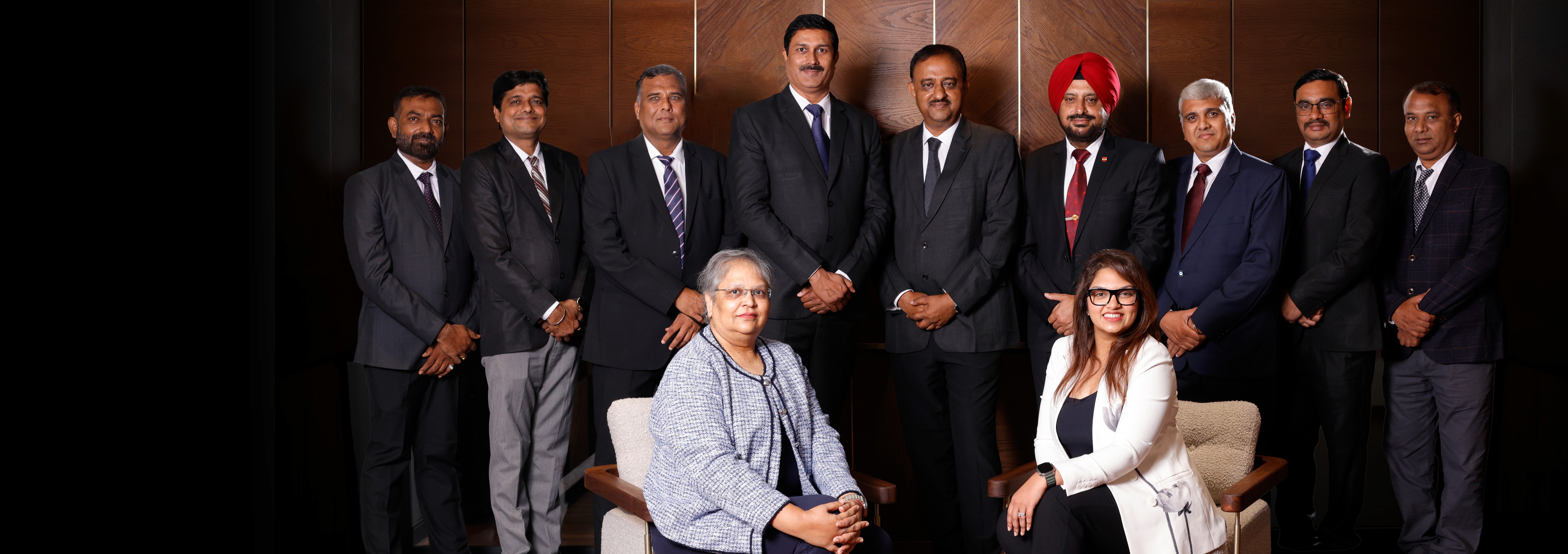
Founded in 2000, Mangalam had built an impeccable reputation for high-accuracy data processing, supporting global law firms and medical institutions. However, their marketing was primarily tactical—focusing on specific service lines rather than a unified corporate identity.
Mangalam
The Challenge
How do you modernize a brand that doesn't want to be rebranded? The brief was contradictory—bring in a refreshing point in their identity, yet ensure the continuity remains untouched. The new generation represented a shift from traditional service delivery to a culture of high-velocity movement and agility. The challenge was to find a visual language that communicated "Growth in Motion" without making the company look like a brand-new, untested startup.
Mangalam
The Solution
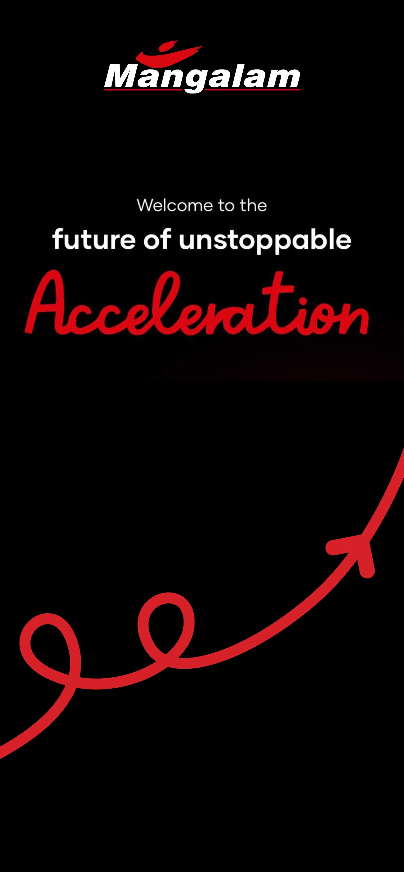
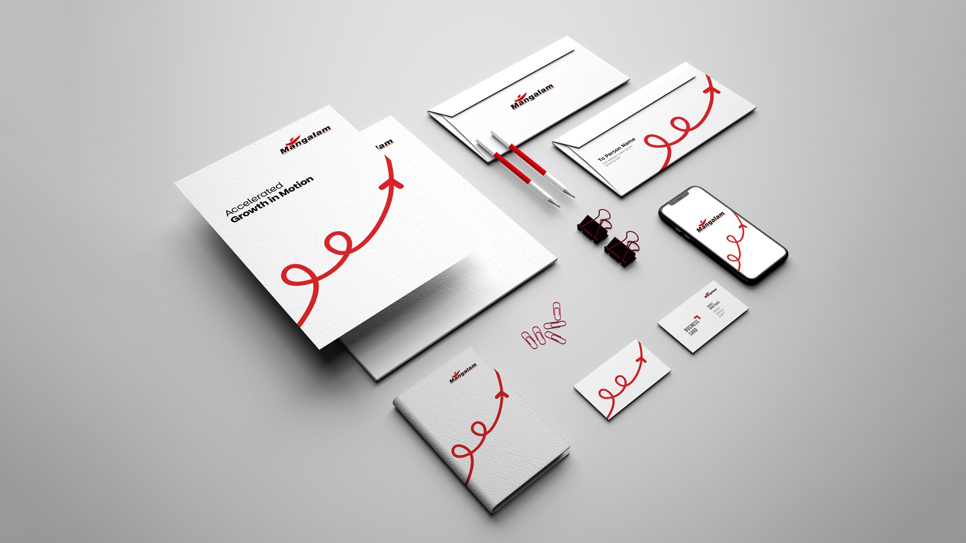
We carried forward the legacy of the original brand—preserving the core DNA—but introduced the concept of Pravaha (Flow). We visualized this through the Loop, signifying that even as the guard changes, the flow of quality and trust is continuous.
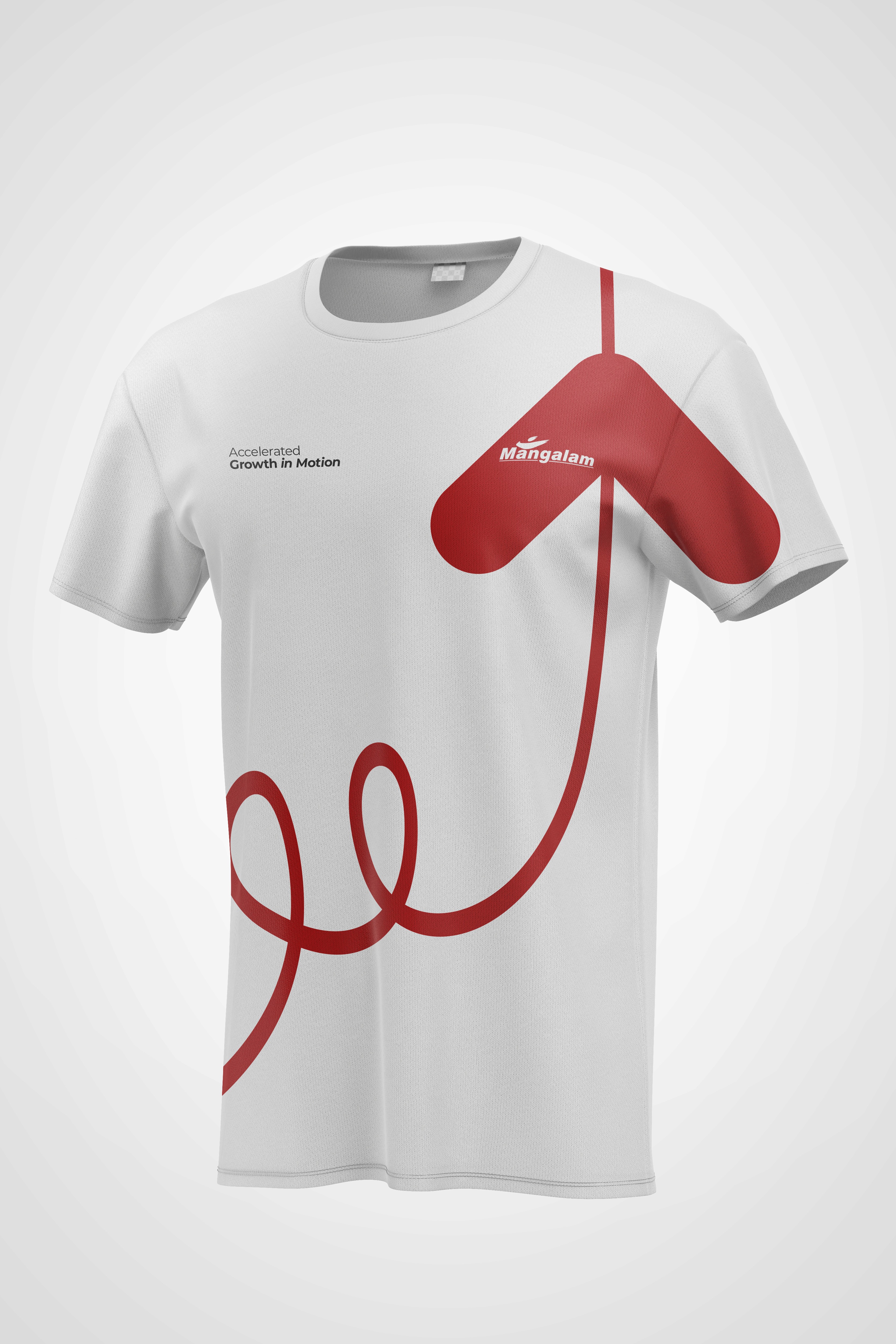
To symbolize the third generation’s energy, we integrated a Growth Arrow into the flow. Unlike a static logo, this design communicated "Accelerated Growth in Motion." This "Refreshed Angle" allowed the new leadership to have a distinct identity that felt modern and agile (Pravaha), while still feeling like the same dependable Mangalam that clients had trusted for 25 years.
Mangalam
Performance Results
The Identity Extension allowed the new generation to step into leadership with a brand that felt like "theirs," without the friction of a total rebrand. It provided a refreshing point of entry for new global conversations while reinforcing the loyalty of existing clients who saw the evolution as a sign of strength and stability.
25 Years Of Legacy
Successfully Preserved
Leadership Alignment
Third Generation Pivot
Employee Engagement
Workforce to Brand Custodians
Mangalam
Final Thoughts
By moving the focus from "what they do" to "who they are," we helped Mangalam break free from the service-commodity cycle. The Pravaha rebrand transformed Mangalam into a sovereign brand that flows with the needs of its clients while standing firm in its values. Today, they don't just process data; they enable global growth through a continuous, agile partnership.
Mangalam
Previous Project
Next Project




Transforming a Legacy KPO into a High-Authority Global Brand
Rebranding
Rebranding
Web Design
Website Development
Mangalam
Transforming a Legacy KPO into a High-Authority Global Brand
For Mangalam Information Technologies, their 25 year old brand identity was their legacy. As they approached their silver jubilee, they were also experiencing a change of guard at the helm. They wanted to signal change while retaining the core brand identity.
Mangalam
Overview
Founded in 2000, Mangalam had built an impeccable reputation for high-accuracy data processing, supporting global law firms and medical institutions. However, their marketing was primarily tactical—focusing on specific service lines rather than a unified corporate identity.
Mangalam
The Challenge
How do you modernize a brand that doesn't want to be rebranded? The brief was contradictory—bring in a refreshing point in their identity, yet ensure the continuity remains untouched. The new generation represented a shift from traditional service delivery to a culture of high-velocity movement and agility. The challenge was to find a visual language that communicated "Growth in Motion" without making the company look like a brand-new, untested startup.
Mangalam
The Solution
We carried forward the legacy of the original brand—preserving the core DNA—but introduced the concept of Pravaha (Flow). We visualized this through the Loop, signifying that even as the guard changes, the flow of quality and trust is continuous.
To symbolize the third generation’s energy, we integrated a Growth Arrow into the flow. Unlike a static logo, this design communicated "Accelerated Growth in Motion." This "Refreshed Angle" allowed the new leadership to have a distinct identity that felt modern and agile (Pravaha), while still feeling like the same dependable Mangalam that clients had trusted for 25 years.
Mangalam
Performance Results
The Identity Extension allowed the new generation to step into leadership with a brand that felt like "theirs," without the friction of a total rebrand. It provided a refreshing point of entry for new global conversations while reinforcing the loyalty of existing clients who saw the evolution as a sign of strength and stability.
25 Years Of Legacy
Successfully Preserved
Leadership Alignment
Third Generation Pivot
Employee Engagement
Workforce to Brand Custodians
Mangalam
Final Thoughts
By moving the focus from "what they do" to "who they are," we helped Mangalam break free from the service-commodity cycle. The Pravaha rebrand transformed Mangalam into a sovereign brand that flows with the needs of its clients while standing firm in its values. Today, they don't just process data; they enable global growth through a continuous, agile partnership.
Mangalam
Previous Project
Next Project
Transforming a Legacy KPO into a High-Authority Global Brand
Rebranding
Rebranding
Web Design
Website Development
Mangalam
Transforming a Legacy KPO into a High-Authority Global Brand
For Mangalam Information Technologies, their 25 year old brand identity was their legacy. As they approached their silver jubilee, they were also experiencing a change of guard at the helm. They wanted to signal change while retaining the core brand identity.
Mangalam
Overview
Founded in 2000, Mangalam had built an impeccable reputation for high-accuracy data processing, supporting global law firms and medical institutions. However, their marketing was primarily tactical—focusing on specific service lines rather than a unified corporate identity.
Mangalam
The Challenge
How do you modernize a brand that doesn't want to be rebranded? The brief was contradictory—bring in a refreshing point in their identity, yet ensure the continuity remains untouched. The new generation represented a shift from traditional service delivery to a culture of high-velocity movement and agility. The challenge was to find a visual language that communicated "Growth in Motion" without making the company look like a brand-new, untested startup.
Mangalam
The Solution
We carried forward the legacy of the original brand—preserving the core DNA—but introduced the concept of Pravaha (Flow). We visualized this through the Loop, signifying that even as the guard changes, the flow of quality and trust is continuous.
To symbolize the third generation’s energy, we integrated a Growth Arrow into the flow. Unlike a static logo, this design communicated "Accelerated Growth in Motion." This "Refreshed Angle" allowed the new leadership to have a distinct identity that felt modern and agile (Pravaha), while still feeling like the same dependable Mangalam that clients had trusted for 25 years.
Mangalam
Performance Results
The Identity Extension allowed the new generation to step into leadership with a brand that felt like "theirs," without the friction of a total rebrand. It provided a refreshing point of entry for new global conversations while reinforcing the loyalty of existing clients who saw the evolution as a sign of strength and stability.
25 Years Of Legacy
Successfully Preserved
Leadership Alignment
Third Generation Pivot
Employee Engagement
Workforce to Brand Custodians
Mangalam
Final Thoughts
By moving the focus from "what they do" to "who they are," we helped Mangalam break free from the service-commodity cycle. The Pravaha rebrand transformed Mangalam into a sovereign brand that flows with the needs of its clients while standing firm in its values. Today, they don't just process data; they enable global growth through a continuous, agile partnership.
Mangalam
Previous Project

Next Project

We Transform Brands. Your Success Is Next.
Start your project now by booking a one-on-one consultation with our expert.
Meet the partners who are part of our success story



We Transform Brands. Your Success Is Next.
Start your project now by booking a one-on-one consultation with our expert.
Meet the partners who are part of our success story
Transforming a Legacy KPO into a High-Authority Global Brand
Rebranding
Rebranding
Web Design
Website Development
Mangalam
Transforming a Legacy KPO into a High-Authority Global Brand
For Mangalam Information Technologies, their 25 year old brand identity was their legacy. As they approached their silver jubilee, they were also experiencing a change of guard at the helm. They wanted to signal change while retaining the core brand identity.
Mangalam
Overview
Founded in 2000, Mangalam had built an impeccable reputation for high-accuracy data processing, supporting global law firms and medical institutions. However, their marketing was primarily tactical—focusing on specific service lines rather than a unified corporate identity.
Mangalam
The Challenge
How do you modernize a brand that doesn't want to be rebranded? The brief was contradictory—bring in a refreshing point in their identity, yet ensure the continuity remains untouched. The new generation represented a shift from traditional service delivery to a culture of high-velocity movement and agility. The challenge was to find a visual language that communicated "Growth in Motion" without making the company look like a brand-new, untested startup.
Mangalam
The Solution
We carried forward the legacy of the original brand—preserving the core DNA—but introduced the concept of Pravaha (Flow). We visualized this through the Loop, signifying that even as the guard changes, the flow of quality and trust is continuous.
To symbolize the third generation’s energy, we integrated a Growth Arrow into the flow. Unlike a static logo, this design communicated "Accelerated Growth in Motion." This "Refreshed Angle" allowed the new leadership to have a distinct identity that felt modern and agile (Pravaha), while still feeling like the same dependable Mangalam that clients had trusted for 25 years.
Mangalam
Performance Results
The Identity Extension allowed the new generation to step into leadership with a brand that felt like "theirs," without the friction of a total rebrand. It provided a refreshing point of entry for new global conversations while reinforcing the loyalty of existing clients who saw the evolution as a sign of strength and stability.
25 Years Of Legacy
Successfully Preserved
Leadership Alignment
Third Generation Pivot
Employee Engagement
Workforce to Brand Custodians
Mangalam
Final Thoughts
By moving the focus from "what they do" to "who they are," we helped Mangalam break free from the service-commodity cycle. The Pravaha rebrand transformed Mangalam into a sovereign brand that flows with the needs of its clients while standing firm in its values. Today, they don't just process data; they enable global growth through a continuous, agile partnership.
Mangalam
Previous Project
Next Project
Transforming a Legacy KPO into a High-Authority Global Brand
Rebranding
Rebranding
Web Design
Website Development
Mangalam
Transforming a Legacy KPO into a High-Authority Global Brand
For Mangalam Information Technologies, their 25 year old brand identity was their legacy. As they approached their silver jubilee, they were also experiencing a change of guard at the helm. They wanted to signal change while retaining the core brand identity.
Mangalam
Overview
Founded in 2000, Mangalam had built an impeccable reputation for high-accuracy data processing, supporting global law firms and medical institutions. However, their marketing was primarily tactical—focusing on specific service lines rather than a unified corporate identity.
Mangalam
The Challenge
How do you modernize a brand that doesn't want to be rebranded? The brief was contradictory—bring in a refreshing point in their identity, yet ensure the continuity remains untouched. The new generation represented a shift from traditional service delivery to a culture of high-velocity movement and agility. The challenge was to find a visual language that communicated "Growth in Motion" without making the company look like a brand-new, untested startup.
Mangalam
The Solution
We carried forward the legacy of the original brand—preserving the core DNA—but introduced the concept of Pravaha (Flow). We visualized this through the Loop, signifying that even as the guard changes, the flow of quality and trust is continuous.
To symbolize the third generation’s energy, we integrated a Growth Arrow into the flow. Unlike a static logo, this design communicated "Accelerated Growth in Motion." This "Refreshed Angle" allowed the new leadership to have a distinct identity that felt modern and agile (Pravaha), while still feeling like the same dependable Mangalam that clients had trusted for 25 years.
Mangalam
Performance Results
The Identity Extension allowed the new generation to step into leadership with a brand that felt like "theirs," without the friction of a total rebrand. It provided a refreshing point of entry for new global conversations while reinforcing the loyalty of existing clients who saw the evolution as a sign of strength and stability.
25 Years Of Legacy
Successfully Preserved
Leadership Alignment
Third Generation Pivot
Employee Engagement
Workforce to Brand Custodians
Mangalam
Final Thoughts
By moving the focus from "what they do" to "who they are," we helped Mangalam break free from the service-commodity cycle. The Pravaha rebrand transformed Mangalam into a sovereign brand that flows with the needs of its clients while standing firm in its values. Today, they don't just process data; they enable global growth through a continuous, agile partnership.
Mangalam
Previous Project
Next Project
Transforming a Legacy KPO into a High-Authority Global Brand
Rebranding
Rebranding
Web Design
Website Development
Mangalam
Transforming a Legacy KPO into a High-Authority Global Brand
For Mangalam Information Technologies, their 25 year old brand identity was their legacy. As they approached their silver jubilee, they were also experiencing a change of guard at the helm. They wanted to signal change while retaining the core brand identity.
Mangalam
Overview
Founded in 2000, Mangalam had built an impeccable reputation for high-accuracy data processing, supporting global law firms and medical institutions. However, their marketing was primarily tactical—focusing on specific service lines rather than a unified corporate identity.
Mangalam
The Challenge
How do you modernize a brand that doesn't want to be rebranded? The brief was contradictory—bring in a refreshing point in their identity, yet ensure the continuity remains untouched. The new generation represented a shift from traditional service delivery to a culture of high-velocity movement and agility. The challenge was to find a visual language that communicated "Growth in Motion" without making the company look like a brand-new, untested startup.
Mangalam
The Solution
We carried forward the legacy of the original brand—preserving the core DNA—but introduced the concept of Pravaha (Flow). We visualized this through the Loop, signifying that even as the guard changes, the flow of quality and trust is continuous.
To symbolize the third generation’s energy, we integrated a Growth Arrow into the flow. Unlike a static logo, this design communicated "Accelerated Growth in Motion." This "Refreshed Angle" allowed the new leadership to have a distinct identity that felt modern and agile (Pravaha), while still feeling like the same dependable Mangalam that clients had trusted for 25 years.
Mangalam
Performance Results
The Identity Extension allowed the new generation to step into leadership with a brand that felt like "theirs," without the friction of a total rebrand. It provided a refreshing point of entry for new global conversations while reinforcing the loyalty of existing clients who saw the evolution as a sign of strength and stability.
25 Years Of Legacy
Successfully Preserved
Leadership Alignment
Third Generation Pivot
Employee Engagement
Workforce to Brand Custodians
Mangalam
Final Thoughts
By moving the focus from "what they do" to "who they are," we helped Mangalam break free from the service-commodity cycle. The Pravaha rebrand transformed Mangalam into a sovereign brand that flows with the needs of its clients while standing firm in its values. Today, they don't just process data; they enable global growth through a continuous, agile partnership.
Mangalam
Previous Project
Next Project
We Transform Brands. Your Success Is Next.
Start your project now by booking a one-on-one consultation with our expert.
Meet the partners who are part of our success story