

From Commodity to a Coveted Seafood Brand
Branding
Branding
Packaging Design
Sailor's Choice
From Commodity to a Coveted Seafood Brand
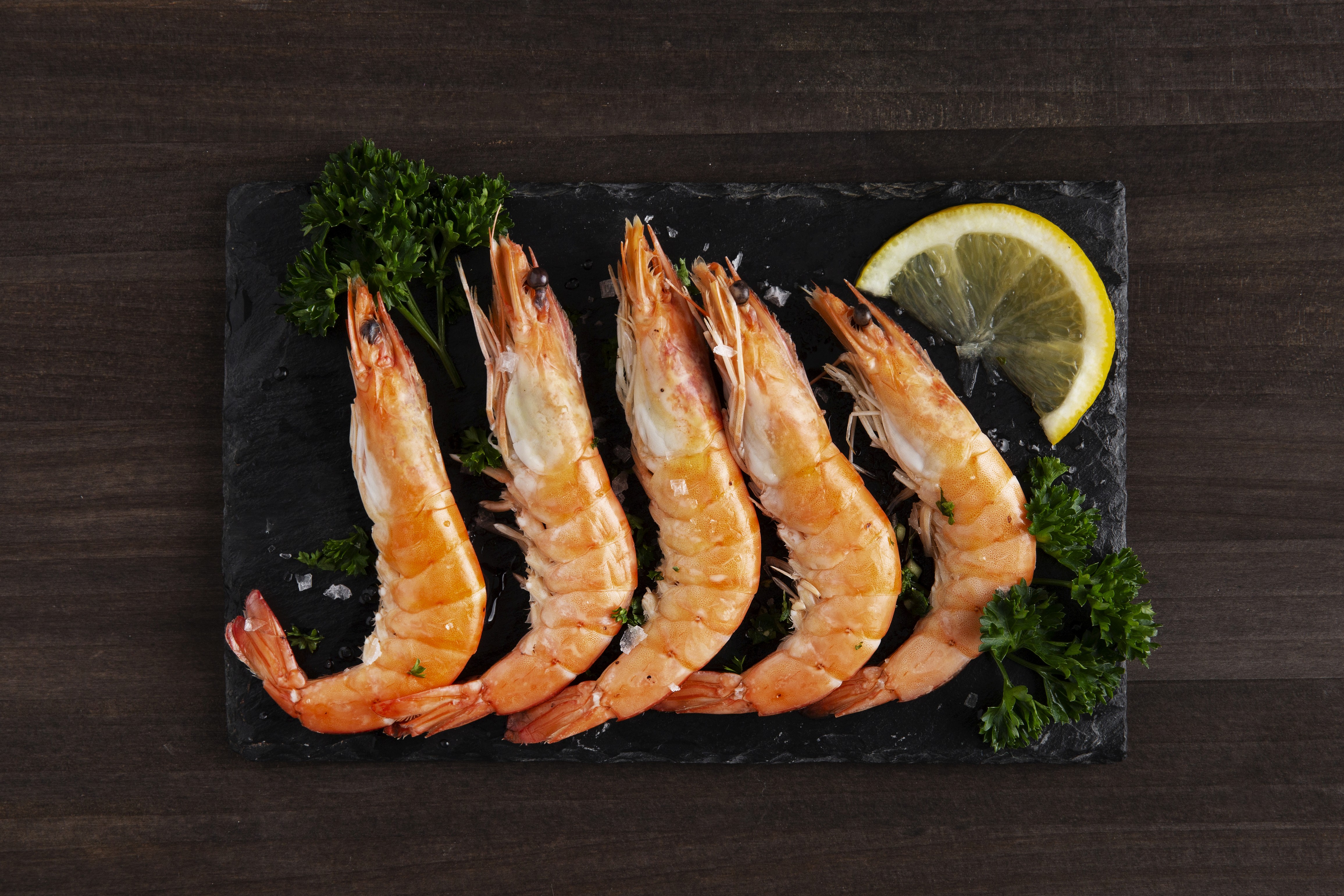
When Hasper Brand Labs, a New Zealand-based global supplier of fresh seafood products, set out to launch a fresh prawn brand, they needed more than just packaging.They needed a brand that could command trust, communicate quality, and stand out in a highly commoditized seafood market.
Sailor's Choice
Overview
Hasper Brand Labs operates at the intersection of global food sourcing and private labeling, delivering seafood and agricultural products across markets. However, while their backend capabilities were strong, their front-end branding needed elevation—especially for their prawn category, which was entering competitive international retail environments. Sailor’s Choice as a product line focuses on premium prawns and shrimp sourced globally, with strict quality standards and traceability. The brand needed to communicate: • Purity and freshness • Trust and traceability • Premium positioning in a crowded seafood category This wasn’t just about aesthetics—it was about building a brand that could influence purchase decisions at the shelf and scale across international markets.
Sailor's Choice
The Challenge
The seafood category is inherently challenging from a branding perspective: • Most products look visually similar (frozen, packaged commodities) • Consumer trust is low due to concerns around freshness and sourcing • Packaging often becomes the only decision-making trigger For Sailor’s Choice, the risk was clear: Without strong branding, it would be perceived as just another generic frozen prawn product. The challenge was not design—it was strategic differentiation in a commoditized category.
Sailor's Choice
The Solution
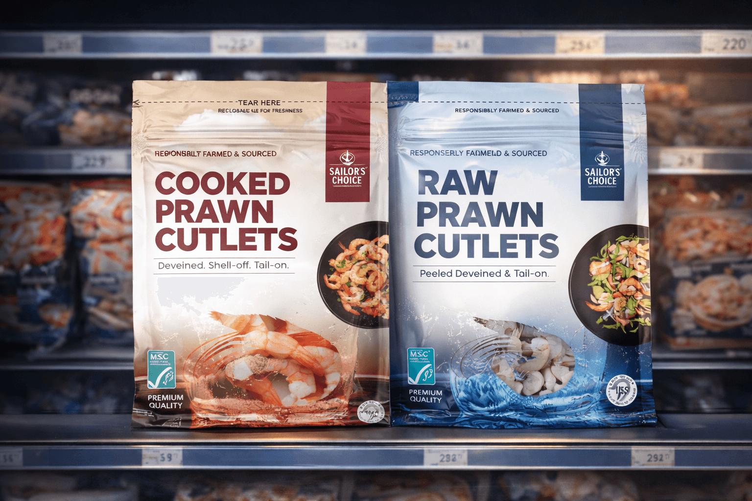
The Go-To Guy approached this as a brand-first problem, not a design-first exercise. Key interventions: • A bold, maritime-inspired identity evoking trust, authenticity, and global sourcing • Confident and premium brand language —reinforcing quality without overcomplication • Oceanic tones, minimal clutter, and strong product visibility
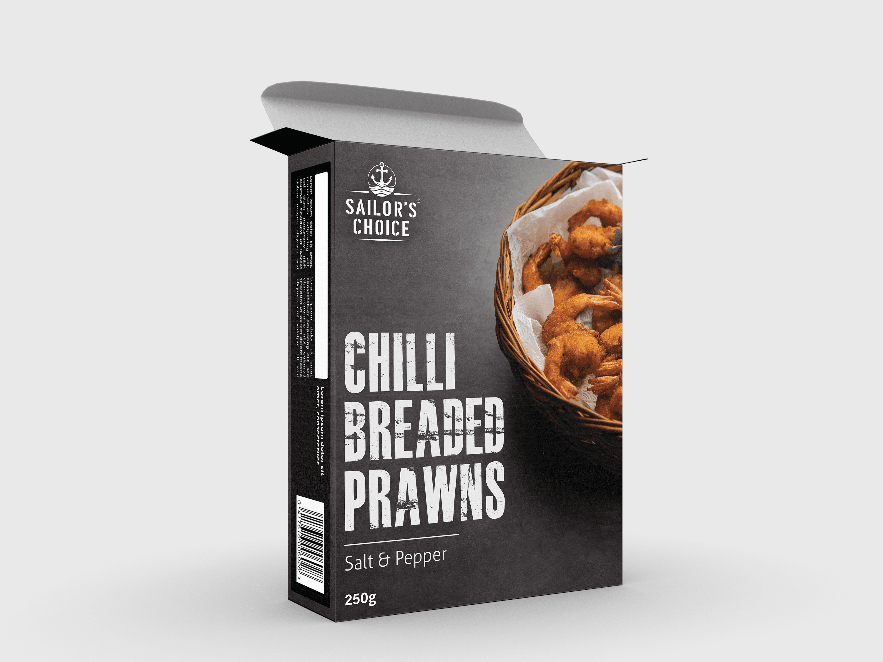
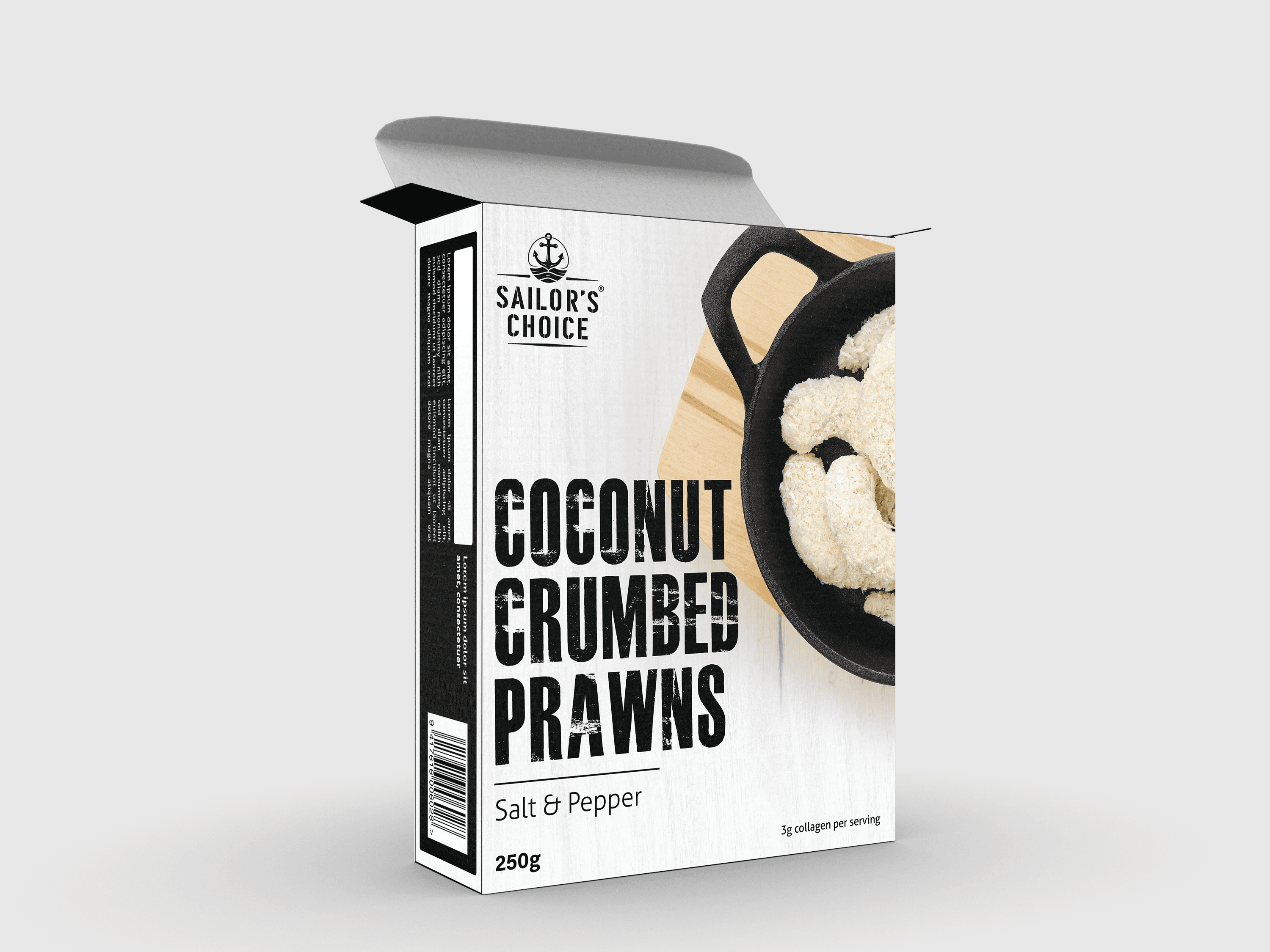
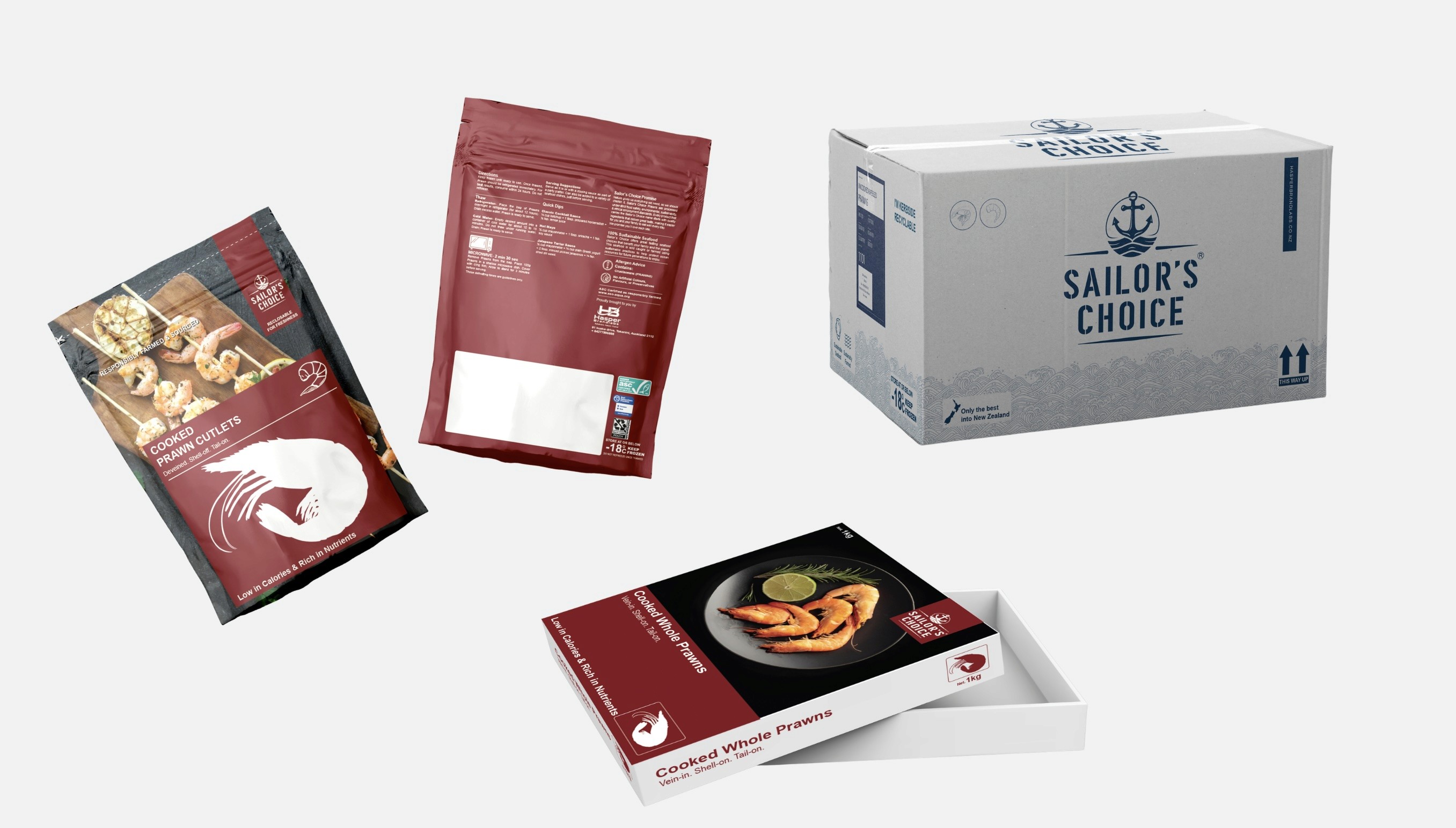
We extended the identity into a complete brand ecosystem: Packaging Design: Designed to stand out in freezer aisles while highlighting product clarity, freshness, and trust signals Information Hierarchy: Structured messaging around quality, sourcing, and product variants to aid quick decision-making Brochure & Collateral: Created sales-ready materials that positioned Sailor’s Choice as a global-quality seafood brand Consistency Across Touchpoints: Ensured the same brand experience across retail, export, and digital platforms The Result: A brand that doesn’t just look premium—but feels credible, scalable, and globally competitive.
Sailor's Choice
Performance Results
Sailor’s Choice is no longer just a seafood product—it is now a brand that signals quality at first glance.
Stronger Brand Recall
Cohesive visual system improved memorability across touchpoints
Perceived Premium Lift
New brand identity repositioned the product from commodity to premium
Shelf Visibility
Improved - Leading to quicker product understanding and selection
Sailor's Choice
Final Thoughts
Beyond design, the project created long-term strategic value for Hasper Brand Labs. Most importantly, this project reinforced a critical shift from selling prawns to building a seafood brand consumers can trust.
Sailor's Choice
Next Project



From Commodity to a Coveted Seafood Brand
Branding
Branding
Packaging Design
Sailor's Choice
From Commodity to a Coveted Seafood Brand
When Hasper Brand Labs, a New Zealand-based global supplier of fresh seafood products, set out to launch a fresh prawn brand, they needed more than just packaging.They needed a brand that could command trust, communicate quality, and stand out in a highly commoditized seafood market.
Sailor's Choice
Overview
Hasper Brand Labs operates at the intersection of global food sourcing and private labeling, delivering seafood and agricultural products across markets. However, while their backend capabilities were strong, their front-end branding needed elevation—especially for their prawn category, which was entering competitive international retail environments. Sailor’s Choice as a product line focuses on premium prawns and shrimp sourced globally, with strict quality standards and traceability. The brand needed to communicate: • Purity and freshness • Trust and traceability • Premium positioning in a crowded seafood category This wasn’t just about aesthetics—it was about building a brand that could influence purchase decisions at the shelf and scale across international markets.
Sailor's Choice
The Challenge
The seafood category is inherently challenging from a branding perspective: • Most products look visually similar (frozen, packaged commodities) • Consumer trust is low due to concerns around freshness and sourcing • Packaging often becomes the only decision-making trigger For Sailor’s Choice, the risk was clear: Without strong branding, it would be perceived as just another generic frozen prawn product. The challenge was not design—it was strategic differentiation in a commoditized category.
Sailor's Choice
The Solution
The Go-To Guy approached this as a brand-first problem, not a design-first exercise. Key interventions: • A bold, maritime-inspired identity evoking trust, authenticity, and global sourcing • Confident and premium brand language —reinforcing quality without overcomplication • Oceanic tones, minimal clutter, and strong product visibility
We extended the identity into a complete brand ecosystem: Packaging Design: Designed to stand out in freezer aisles while highlighting product clarity, freshness, and trust signals Information Hierarchy: Structured messaging around quality, sourcing, and product variants to aid quick decision-making Brochure & Collateral: Created sales-ready materials that positioned Sailor’s Choice as a global-quality seafood brand Consistency Across Touchpoints: Ensured the same brand experience across retail, export, and digital platforms The Result: A brand that doesn’t just look premium—but feels credible, scalable, and globally competitive.
Sailor's Choice
Performance Results
Sailor’s Choice is no longer just a seafood product—it is now a brand that signals quality at first glance.
Stronger Brand Recall
Cohesive visual system improved memorability across touchpoints
Perceived Premium Lift
New brand identity repositioned the product from commodity to premium
Shelf Visibility
Improved - Leading to quicker product understanding and selection
Sailor's Choice
Final Thoughts
Beyond design, the project created long-term strategic value for Hasper Brand Labs. Most importantly, this project reinforced a critical shift from selling prawns to building a seafood brand consumers can trust.
Sailor's Choice
Next Project
From Commodity to a Coveted Seafood Brand
Branding
Branding
Packaging Design
Sailor's Choice
From Commodity to a Coveted Seafood Brand
When Hasper Brand Labs, a New Zealand-based global supplier of fresh seafood products, set out to launch a fresh prawn brand, they needed more than just packaging.They needed a brand that could command trust, communicate quality, and stand out in a highly commoditized seafood market.
Sailor's Choice
Overview
Hasper Brand Labs operates at the intersection of global food sourcing and private labeling, delivering seafood and agricultural products across markets. However, while their backend capabilities were strong, their front-end branding needed elevation—especially for their prawn category, which was entering competitive international retail environments. Sailor’s Choice as a product line focuses on premium prawns and shrimp sourced globally, with strict quality standards and traceability. The brand needed to communicate: • Purity and freshness • Trust and traceability • Premium positioning in a crowded seafood category This wasn’t just about aesthetics—it was about building a brand that could influence purchase decisions at the shelf and scale across international markets.
Sailor's Choice
The Challenge
The seafood category is inherently challenging from a branding perspective: • Most products look visually similar (frozen, packaged commodities) • Consumer trust is low due to concerns around freshness and sourcing • Packaging often becomes the only decision-making trigger For Sailor’s Choice, the risk was clear: Without strong branding, it would be perceived as just another generic frozen prawn product. The challenge was not design—it was strategic differentiation in a commoditized category.
Sailor's Choice
The Solution
The Go-To Guy approached this as a brand-first problem, not a design-first exercise. Key interventions: • A bold, maritime-inspired identity evoking trust, authenticity, and global sourcing • Confident and premium brand language —reinforcing quality without overcomplication • Oceanic tones, minimal clutter, and strong product visibility
We extended the identity into a complete brand ecosystem: Packaging Design: Designed to stand out in freezer aisles while highlighting product clarity, freshness, and trust signals Information Hierarchy: Structured messaging around quality, sourcing, and product variants to aid quick decision-making Brochure & Collateral: Created sales-ready materials that positioned Sailor’s Choice as a global-quality seafood brand Consistency Across Touchpoints: Ensured the same brand experience across retail, export, and digital platforms The Result: A brand that doesn’t just look premium—but feels credible, scalable, and globally competitive.
Sailor's Choice
Performance Results
Sailor’s Choice is no longer just a seafood product—it is now a brand that signals quality at first glance.
Stronger Brand Recall
Cohesive visual system improved memorability across touchpoints
Perceived Premium Lift
New brand identity repositioned the product from commodity to premium
Shelf Visibility
Improved - Leading to quicker product understanding and selection
Sailor's Choice
Final Thoughts
Beyond design, the project created long-term strategic value for Hasper Brand Labs. Most importantly, this project reinforced a critical shift from selling prawns to building a seafood brand consumers can trust.
Sailor's Choice
Next Project


We Transform Brands. Your Success Is Next.
Start your project now by booking a one-on-one consultation with our expert.
Meet the partners who are part of our success story



We Transform Brands. Your Success Is Next.
Start your project now by booking a one-on-one consultation with our expert.
Meet the partners who are part of our success story
From Commodity to a Coveted Seafood Brand
Branding
Branding
Packaging Design
Sailor's Choice
From Commodity to a Coveted Seafood Brand
When Hasper Brand Labs, a New Zealand-based global supplier of fresh seafood products, set out to launch a fresh prawn brand, they needed more than just packaging.They needed a brand that could command trust, communicate quality, and stand out in a highly commoditized seafood market.
Sailor's Choice
Overview
Hasper Brand Labs operates at the intersection of global food sourcing and private labeling, delivering seafood and agricultural products across markets. However, while their backend capabilities were strong, their front-end branding needed elevation—especially for their prawn category, which was entering competitive international retail environments. Sailor’s Choice as a product line focuses on premium prawns and shrimp sourced globally, with strict quality standards and traceability. The brand needed to communicate: • Purity and freshness • Trust and traceability • Premium positioning in a crowded seafood category This wasn’t just about aesthetics—it was about building a brand that could influence purchase decisions at the shelf and scale across international markets.
Sailor's Choice
The Challenge
The seafood category is inherently challenging from a branding perspective: • Most products look visually similar (frozen, packaged commodities) • Consumer trust is low due to concerns around freshness and sourcing • Packaging often becomes the only decision-making trigger For Sailor’s Choice, the risk was clear: Without strong branding, it would be perceived as just another generic frozen prawn product. The challenge was not design—it was strategic differentiation in a commoditized category.
Sailor's Choice
The Solution
The Go-To Guy approached this as a brand-first problem, not a design-first exercise. Key interventions: • A bold, maritime-inspired identity evoking trust, authenticity, and global sourcing • Confident and premium brand language —reinforcing quality without overcomplication • Oceanic tones, minimal clutter, and strong product visibility
We extended the identity into a complete brand ecosystem: Packaging Design: Designed to stand out in freezer aisles while highlighting product clarity, freshness, and trust signals Information Hierarchy: Structured messaging around quality, sourcing, and product variants to aid quick decision-making Brochure & Collateral: Created sales-ready materials that positioned Sailor’s Choice as a global-quality seafood brand Consistency Across Touchpoints: Ensured the same brand experience across retail, export, and digital platforms The Result: A brand that doesn’t just look premium—but feels credible, scalable, and globally competitive.
Sailor's Choice
Performance Results
Sailor’s Choice is no longer just a seafood product—it is now a brand that signals quality at first glance.
Stronger Brand Recall
Cohesive visual system improved memorability across touchpoints
Perceived Premium Lift
New brand identity repositioned the product from commodity to premium
Shelf Visibility
Improved - Leading to quicker product understanding and selection
Sailor's Choice
Final Thoughts
Beyond design, the project created long-term strategic value for Hasper Brand Labs. Most importantly, this project reinforced a critical shift from selling prawns to building a seafood brand consumers can trust.
Sailor's Choice
Next Project
From Commodity to a Coveted Seafood Brand
Branding
Branding
Packaging Design
Sailor's Choice
From Commodity to a Coveted Seafood Brand
When Hasper Brand Labs, a New Zealand-based global supplier of fresh seafood products, set out to launch a fresh prawn brand, they needed more than just packaging.They needed a brand that could command trust, communicate quality, and stand out in a highly commoditized seafood market.
Sailor's Choice
Overview
Hasper Brand Labs operates at the intersection of global food sourcing and private labeling, delivering seafood and agricultural products across markets. However, while their backend capabilities were strong, their front-end branding needed elevation—especially for their prawn category, which was entering competitive international retail environments. Sailor’s Choice as a product line focuses on premium prawns and shrimp sourced globally, with strict quality standards and traceability. The brand needed to communicate: • Purity and freshness • Trust and traceability • Premium positioning in a crowded seafood category This wasn’t just about aesthetics—it was about building a brand that could influence purchase decisions at the shelf and scale across international markets.
Sailor's Choice
The Challenge
The seafood category is inherently challenging from a branding perspective: • Most products look visually similar (frozen, packaged commodities) • Consumer trust is low due to concerns around freshness and sourcing • Packaging often becomes the only decision-making trigger For Sailor’s Choice, the risk was clear: Without strong branding, it would be perceived as just another generic frozen prawn product. The challenge was not design—it was strategic differentiation in a commoditized category.
Sailor's Choice
The Solution
The Go-To Guy approached this as a brand-first problem, not a design-first exercise. Key interventions: • A bold, maritime-inspired identity evoking trust, authenticity, and global sourcing • Confident and premium brand language —reinforcing quality without overcomplication • Oceanic tones, minimal clutter, and strong product visibility
We extended the identity into a complete brand ecosystem: Packaging Design: Designed to stand out in freezer aisles while highlighting product clarity, freshness, and trust signals Information Hierarchy: Structured messaging around quality, sourcing, and product variants to aid quick decision-making Brochure & Collateral: Created sales-ready materials that positioned Sailor’s Choice as a global-quality seafood brand Consistency Across Touchpoints: Ensured the same brand experience across retail, export, and digital platforms The Result: A brand that doesn’t just look premium—but feels credible, scalable, and globally competitive.
Sailor's Choice
Performance Results
Sailor’s Choice is no longer just a seafood product—it is now a brand that signals quality at first glance.
Stronger Brand Recall
Cohesive visual system improved memorability across touchpoints
Perceived Premium Lift
New brand identity repositioned the product from commodity to premium
Shelf Visibility
Improved - Leading to quicker product understanding and selection
Sailor's Choice
Final Thoughts
Beyond design, the project created long-term strategic value for Hasper Brand Labs. Most importantly, this project reinforced a critical shift from selling prawns to building a seafood brand consumers can trust.
Sailor's Choice
Next Project
From Commodity to a Coveted Seafood Brand
Branding
Branding
Packaging Design
Sailor's Choice
From Commodity to a Coveted Seafood Brand
When Hasper Brand Labs, a New Zealand-based global supplier of fresh seafood products, set out to launch a fresh prawn brand, they needed more than just packaging.They needed a brand that could command trust, communicate quality, and stand out in a highly commoditized seafood market.
Sailor's Choice
Overview
Hasper Brand Labs operates at the intersection of global food sourcing and private labeling, delivering seafood and agricultural products across markets. However, while their backend capabilities were strong, their front-end branding needed elevation—especially for their prawn category, which was entering competitive international retail environments. Sailor’s Choice as a product line focuses on premium prawns and shrimp sourced globally, with strict quality standards and traceability. The brand needed to communicate: • Purity and freshness • Trust and traceability • Premium positioning in a crowded seafood category This wasn’t just about aesthetics—it was about building a brand that could influence purchase decisions at the shelf and scale across international markets.
Sailor's Choice
The Challenge
The seafood category is inherently challenging from a branding perspective: • Most products look visually similar (frozen, packaged commodities) • Consumer trust is low due to concerns around freshness and sourcing • Packaging often becomes the only decision-making trigger For Sailor’s Choice, the risk was clear: Without strong branding, it would be perceived as just another generic frozen prawn product. The challenge was not design—it was strategic differentiation in a commoditized category.
Sailor's Choice
The Solution
The Go-To Guy approached this as a brand-first problem, not a design-first exercise. Key interventions: • A bold, maritime-inspired identity evoking trust, authenticity, and global sourcing • Confident and premium brand language —reinforcing quality without overcomplication • Oceanic tones, minimal clutter, and strong product visibility
We extended the identity into a complete brand ecosystem: Packaging Design: Designed to stand out in freezer aisles while highlighting product clarity, freshness, and trust signals Information Hierarchy: Structured messaging around quality, sourcing, and product variants to aid quick decision-making Brochure & Collateral: Created sales-ready materials that positioned Sailor’s Choice as a global-quality seafood brand Consistency Across Touchpoints: Ensured the same brand experience across retail, export, and digital platforms The Result: A brand that doesn’t just look premium—but feels credible, scalable, and globally competitive.
Sailor's Choice
Performance Results
Sailor’s Choice is no longer just a seafood product—it is now a brand that signals quality at first glance.
Stronger Brand Recall
Cohesive visual system improved memorability across touchpoints
Perceived Premium Lift
New brand identity repositioned the product from commodity to premium
Shelf Visibility
Improved - Leading to quicker product understanding and selection
Sailor's Choice
Final Thoughts
Beyond design, the project created long-term strategic value for Hasper Brand Labs. Most importantly, this project reinforced a critical shift from selling prawns to building a seafood brand consumers can trust.
Sailor's Choice
Next Project
We Transform Brands. Your Success Is Next.
Start your project now by booking a one-on-one consultation with our expert.
Meet the partners who are part of our success story